How the map of Middle-earth was built
A photoshop parchment map, 1,400 image tiles, a coordinate system, and a weird satellite view of a place that has never been photographed...
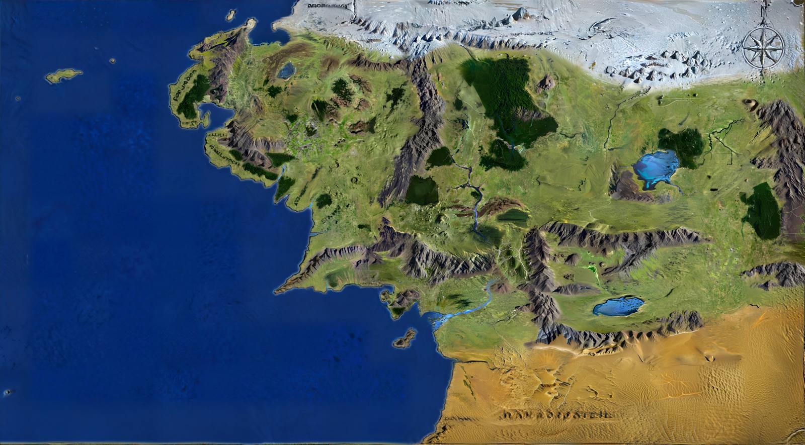
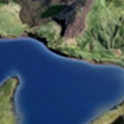
This site has two visual layers over the same imaginary ground. The first is a scan of a hand-drawn parchment map, cut into tiles so it can be zoomed and panned smoothly. The second is a synthetic satellite view: an attempt to answer what Middle-earth would look like from orbit, generated from scratch because no such imagery exists and never has.
The second layer is the interesting one, and most of this page is about it. But it only works because of decisions made in the first, so we start there.
Part OneThe parchment map and the tile pyramid
The amazing parchment artwork on this site is not mine. I found it in a Reddit thread and the credit goes (I believe) to Kerem Yurtseven from İzmir, Turkey.
The source is a single JPEG, 7680 × 4320 pixels. Serving that as one image would mean a multi-megabyte download before anything appears, and the browser holding the entire decoded bitmap — roughly 130 MB in memory — whether you are looking at the Shire or at Mordor.
The standard fix is a tile pyramid. The image is pre-cut into a grid of small square images at several resolutions. The viewer downloads only the tiles covering the visible area at the current zoom, typically a few dozen at a time. It is how every web map works, and it is entirely mechanical:
| Directory | Scale | Grid | Tiles |
|---|---|---|---|
tiles/0/ | ¼ — 1920 × 1097 | 8 × 5 | 40 |
tiles/1/ | ½ — 3840 × 2193 | 15 × 9 | 135 |
tiles/2/ | Native — 7680 × 4386 | 30 × 18 | 540 |
That is 715 tiles totalling about 18 MB, each a 256 × 256 JPEG at quality 85, resampled with Lanczos filtering. Tiles at the right and bottom edges do not divide evenly, so they are padded to a full square with the site's background colour rather than left ragged — a partial tile would otherwise show a hard seam against the page.
A coordinate system with no geography
Web mapping libraries normally expect latitude and longitude, and project a curved Earth onto a flat screen. Middle-earth has no such thing, and forcing the map into a real projection would stretch it in ways that make no sense.
So the map runs on Leaflet with L.CRS.Simple and an identity transformation. Coordinates are simply pixels in the source image: y down, x across, no projection, no curvature, no datum. A marker at Bag End is stored as px 2746, py 1115 and that is all it means. The whole map is one flat picture with a grid on it.
Leaflet's zoom levels are offset so that directory 2 — the native-resolution tiles — sits at map zoom 0, with the half and quarter scales at −1 and −2. Zooming beyond that upscales the native tiles rather than loading anything sharper, because nothing sharper exists. The parchment's own paper grain sets the real limit on useful magnification.
Why not MBTiles, or a tile server?
This is the question that comes up most often, so it is worth answering directly: there is no tile server here at all. Nothing runs. Every tile is an ordinary file on disk at tiles/{z}/{x}/{y}.jpg, served by a CDN exactly like any other static asset.
That layout is not homemade — it is the standard XYZ or “slippy map” convention that Leaflet, OpenStreetMap and most web maps already speak, which is why the tile layer is a one-line declaration with a URL template in it. MBTiles, by contrast, packs tiles into a SQLite container. That is genuinely useful when you are shipping a tileset as one file or serving it from an application that can query it — but it requires something to unpack and serve the rows. Here it would mean introducing a server purely to undo the packaging, in exchange for a directory listing nobody sees.
The trade is real, though, and worth being honest about: this approach means 1,400 small files in version control, which is not what git is designed for, and regenerating a tileset rewrites all of them at once. A container format would make that far tidier. For a map that changes roughly never and is read constantly, the cost falls in the right place.
Part TwoPutting 128 events in the right place
Every marker needs a pixel coordinate, and reading them off a fantasy map by eye is less accurate than it sounds. The first pass was visibly wrong in places — drifting further off toward the edges, which is the signature of a systematic error rather than random sloppiness.
The fix was to fix seven locations precisely by hand — Bag End, Erebor, Mount Doom, Helm's Deep, Osgiliath, Minas Tirith and Moria — then solve for the affine transformation that best mapped the estimated positions onto those known ones, and apply it to every remaining marker. An affine transform captures exactly the errors you get from eyeballing a scanned image: uniform scale, shear, rotation and offset. The seven anchors keep their exact hand-set values; everything else inherits the correction. Remaining outliers were then nudged individually.
On top of the markers sit nine journey paths. Drawn as raw waypoint lists these look like polygons, so each path is smoothed with Catmull-Rom spline interpolation — a curve that passes exactly through its control points rather than merely near them, which matters when a control point is a real place. Interpolation is skipped for waypoints closer than a threshold, since smoothing a tight cluster produces loops and cusps rather than a plausible route.
The dataset that all of this reads from holds 128 events across six categories, 43 typed links between them (cause, sequel, parallel, legacy, location), and the nine journeys. It is a single plain JavaScript file shared by the map and the timeline, so both pages always agree.
For all the machinery described elsewhere on this page, placing the markers was comfortably the hardest part of the project, and the part that most resisted automation. Asking a language model for a pixel coordinate on an unlabelled fantasy map turns out to be something they are genuinely bad at — even with a dozen correct pins already on the map to reason from, the next one would still land in the wrong valley. Every marker here has been checked by eye, and readers have caught ones I missed: Cirith Ungol and Henneth Annûn were both sitting too far north and east until someone pointed it out.
Which age is this map, though?
A fair challenge, and the site papers over it slightly. This is a Third Age map, and Middle-earth was not a fixed place. Using one map for the whole legendarium is a compromise, not an accuracy claim.
The sharpest limit is Beleriand, the entire north-western region where most of The Silmarillion takes place. It broke and sank beneath the sea at the end of the First Age, in the War of Wrath. It is not that those events are hard to place on this map — the land they happened on is not on it at all, because it no longer exists. So they are absent.
What survives is mostly Second Age, which maps onto this geography without much trouble. A handful of First Age markers are approximations and should be read as such: Cuiviénen, where the Elves awoke, sat by the inland Sea of Helcar, and that whole region was reshaped when Morgoth's northern strongholds were destroyed.
Several place names are also late-Third-Age labels applied to much older places. Dol Guldur was Amon Lanc in the Second Age; Lothlórien was Laurelindórenan; Mirkwood, Minas Tirith and Minas Morgul are all later names too. The map shows the names a reader of The Lord of the Rings will recognise, which is the right call for a companion to the books, but it does mean an event pinned to “Dol Guldur” in the Second Age is being labelled with a name nobody used yet.
Part ThreeBuilding a satellite view of a place that does not exist
This layer was not part of the plan. It exists because someone reading about the project said they would love to see the map fed through an image generator to look like satellite imagery — so I tried it that evening, and the result was bad enough to be interesting. Nearly every design decision described below is a direct response to a specific complaint about that first attempt.
Here is the actual problem. A satellite image of Middle-earth cannot be photographed, and cannot be derived from real elevation data, because there is none. The only source of truth is a drawing — and a stylised one, where a mountain range is a row of little hand-inked triangles and a forest is a texture of scribbled canopy.
Feeding that drawing straight to an image generator does not work. It has no idea which brown squiggle is a mountain and which is a label, and it will happily turn the Sea of Rhûn into a desert or write invented text across Rohan. The generated result also drifts: run it on adjacent regions and you get two incompatible worlds that do not join up.
The pipeline that eventually worked is six stages, and its central idea is that the diffusion model is never allowed to decide what anything is. That is settled before it runs. The model only decides what things look like.
Stage 1 — Painting the world by hand
The foundation is not code. It is a Photoshop document in which every region of the map was traced by hand into 13 labelled layers, one per terrain type. This is the slow, unglamorous part, and everything downstream depends on its accuracy.
| Layer | Coverage | Layer | Coverage |
|---|---|---|---|
| ocean | 35.3% | ice land | 8.6% |
| prairie | 33.0% | forest | 3.5% |
| desert | 10.4% | hills | 1.6% |
| edge | 9.4% | rivers & lakes | 1.2% |
| mountains | 8.5% | swamp | 0.4% |
With these masks, every pixel of the map has a known type before any generation happens. The ocean is the ocean because someone said so, not because a model guessed.
Stage 2 — Inventing an elevation model
Hillshading — the effect that makes terrain read as three-dimensional — needs a height value per pixel. Middle-earth has none, so one is fabricated. Each mask is assigned a base height, then blurred to blend into its neighbours:
| Terrain | Height | Blur σ | Effect |
|---|---|---|---|
| mountains | 240 | 5 | Near-maximum, crisp edges so ranges stay sharp |
| hills | 118 | 25 | Intermediate, moderate blending |
| forest | 62 | 35 | Slightly raised over plains |
| prairie | 55 | 40 | Broad, soft transitions |
| swamp | 16 | 12 | Low-lying, tight to its boundary |
| ocean | 4 | 15 | Effectively sea level |
Flat plateaus per terrain type would look artificial, so the parchment itself is used as a modulation source at two different blur scales, and this is the trick that makes the whole thing work:
- Broad blur (σ = 25) destroys all text and fine linework while preserving large-scale tonal variation. Place names and the compass rose disappear; the paper's broad shading survives as gentle topographic undulation.
- Fine blur (σ = 6), blended in strongly only inside mountain zones, preserves the hatching of the individual hand-drawn mountain symbols — so each inked triangle becomes an actual peak with its own shape.
The cartographer's drawing decisions therefore survive into the terrain. Where the illustrator drew a taller triangle, the satellite view has a taller mountain.
Stage 3 — Hillshading
The synthetic elevation is lit with a virtual sun at 315° azimuth and 45° altitude — the standard cartographic convention of light from the upper left, which the eye reads as raised rather than sunken. A vertical exaggeration factor stretches the modest height range into steep virtual slopes, producing strong shadow contrast, and an unsharp-mask pass emphasises ridgelines.
Stage 4 — Colour
Each terrain type gets a base colour, multiplied by the hillshade so that slope shading shows through. Two extra passes add the details that sell it:
- Beaches. Coastline is walked in segments of about 180 pixels; roughly 42% of segments become a sandy strip 14 pixels wide on the land side. The randomness is seeded, so the result is identical on every run — an unbroken beach around every coast would look wrong, but so would a coastline with no beaches at all.
- Snow. Applied to the upper portion of each mountain cluster by its peaked height profile rather than by absolute altitude, so isolated peaks get caps proportional to themselves instead of only the tallest range in the world turning white.
Stage 5 — Diffusion, on a tight leash
Only now does a generative model appear, and it is deliberately constrained. The assembled colour-and-shade image is cut into 512 × 512 patches with 96 pixels of overlap — 240 of them — and each is passed through Stable Diffusion 1.5 in img2img mode, which starts from the existing image rather than from noise.
Three things keep it honest:
Per-biome prompts. Each patch is described by whatever the masks say is actually in it — "dense dark green forest canopy from above, individual tree crowns visible" for forest, "murky dark marshland, standing brown pools between reeds" for swamp. A long shared negative prompt suppresses the failure modes: text and labels, parchment texture, illustration style, and — a specific recurring problem — modern agricultural field patterns, which diffusion models are strongly inclined to hallucinate across any open plain.
Per-biome denoising strength. This is the most important dial. Denoising strength sets how far the model may depart from the input. Ocean is held near 0.30, because open water should stay flat and any creative freedom there produces unwanted islands and swirls. Mountains are pushed to 0.72, where the model is free to invent rock, scree and snowfields on top of the hillshaded skeleton. The production run used a base strength of 0.62.
Settlement awareness. Twenty known locations carry their own descriptive text, injected into the prompt whenever a patch falls within 350 pixels of them — "tiered white stone city built into mountainside, concentric walls" at Minas Tirith, "fortress carved into cliff face with long stone dam" at Helm's Deep. The model is not asked to know the lore. It is told.
Stage 6 — Assembly
The 240 patches are feathered together across their 96-pixel overlaps, sharpened, and sliced into a second tile pyramid: 685 tiles, about 8 MB, sitting in the same coordinate space as the parchment so the two layers register exactly. The whole run takes a few hours on an Apple Silicon laptop, generating locally with no cloud API involved.
What it actually looks like
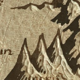 Parchment
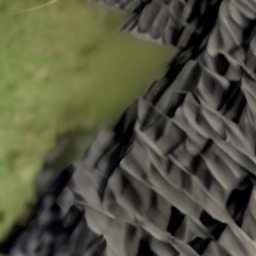 Satellite
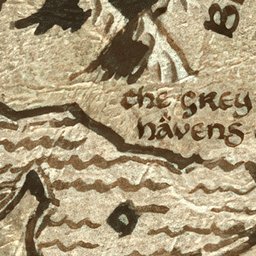 Parchment
 Satellite
Part FourThe attempts that failed
The pipeline above is version six. The earlier ones are worth describing, because each failed in a way that produced the next constraint.
Straight image-to-image on the parchment. The first approach upscaled the map and ran diffusion over it with a single global prompt about satellite photography. Without masks the model had no idea what it was looking at, and without per-region prompting it applied one aesthetic everywhere. The output was recognisably Earth rather than Middle-earth: one generation covered the north-west of the map in desert scrub cut through by a highway interchange, complete with the straight lines and right angles of modern road engineering. It was committed to version control before anyone looked at it closely, which is its own lesson.
The public verdict was blunt and completely correct. The sea is very dry. The water was rendered as land. Everything came out arid because the model was reading the parchment's brown ink as desert, when the terrain it should have been suggesting is closer to New Zealand. Zooming into Fangorn set off at least one reader's trypophobia. And the obvious diagnosis came with it: the model needed a metadata layer telling it water from land from prairie from forest, and the whole thing needed rerunning with that context.
That suggestion is the entire reason stage 1 exists. The 13 hand-painted masks are that metadata layer.
Fully procedural, no diffusion. The opposite extreme also exists in the repository: a generator that builds the terrain entirely from masks, hillshade, hypsometric colour ramps and fractal noise, with no model at all. It is completely controllable and completely consistent — and it looks synthetic, because procedural noise does not produce the irregularity of real landscape. It is what stage 4 of the final pipeline is descended from. Its lesson was that the model earns its place at exactly one job: surface texture.
Too much freedom over water. Uniform denoising strength across the whole map let the model treat open ocean as an invitation. Oceans acquired texture, currents and the occasional island. Hence the per-biome strengths, and hence ocean being clamped hardest of all.
Every improvement came from taking a decision away from the model and settling it beforehand — what terrain this is, how high it stands, where the sun is, what colour it starts from, how far the output may drift. The final pipeline is mostly deterministic image processing, with a diffusion model doing one narrow job at the very end.
Part FiveHow the site is served
There is no build step, no framework and no bundler. The site is hand-written HTML, CSS and JavaScript, with Leaflet as the only runtime dependency, and every page is a static file. The tiles are static files too, which is the whole point of pre-generating them: serving a tile is serving a JPEG, and it costs a CDN nothing.
It is hosted on Firebase Hosting, with tiles cached for 24 hours and the shared data file for one hour. About 1,400 tiles across the two layers total roughly 26 MB — a large repository, but a small page, because any single view only ever fetches the few dozen tiles you can actually see.
Part SixA note on how this was made
Much of the code here was written with a language model, a fair amount of it from an economy seat somewhere over the middle of America. I have seen the reasonable objection to that: knowing a thing was built with AI can drain away the sense that someone cared enough to make it. That is a real reaction and I do not think it is unfair.
What I would offer against it is where the hours actually went. The model wrote code quickly and was useless at the parts that mattered most. It could not place a marker on an unlabelled map to save its life. It could not decide which of the Silmarillion's events survive the drowning of Beleriand. It certainly did not trace 13 terrain masks over a 7680-pixel image by hand, which is the single most laborious thing in this repository and the thing everything else depends on. The project started as a way to read more carefully — to work out what happened where, and in what order — and that reading is not something that can be delegated.
The satellite pipeline makes the same point in miniature. Every version got better by giving the model less to decide.
What people have asked for next
Recurring requests, recorded here mostly so I do not forget them: a proper First Age map of Beleriand, which needs a source map I do not yet have; smoother pinch-zoom on mobile, which is a genuine rough edge; restructuring the markers so that a place and the events at that place are separate things rather than competing pins; alternate era-appropriate names; year labels on every event that can be pinned down; and a spoiler warning, from someone reading the books for the first time who reached the end of the story on a map before reaching it in the text. Sorry about that one.